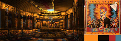
Here's my workflow for doing paintovers, and a few material/texture tricks I learned.
I should note that I am using my wacom tablet for just about all of my drawing, only using my mouse for selecting stuff, potentially everything I do could be done with a mouse, but it's going to be a pain in the ass to do that.
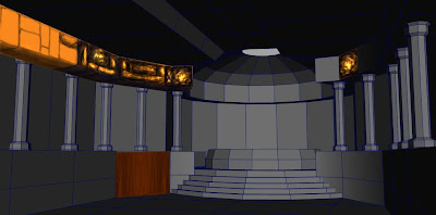
First thing I usually do is figure out what each surface is made of (brick, tile, marble, organic, industrial, etc.) then chose a color scheme that would be appropriate for whatever kind of materials I've chosen. (Though in the case of this assignment I actually did it the other way around.) Then I figure out what base color I want each surface to be. Then I select each surface or area with the polygonal lasso tool and give it its own layer, then fill the selection with the color I chose for that surface. For instance here I chose yellow-orange for the brick color. (By the way to make color assigning faster put your color swatch on its own layer at the very top.)

If you can imagine if I were to do this for most of the surfaces in the scene, it would look really flat and cartoony, so if you're having trouble and your scene looks like this, you aren't doing anything wrong its just that you have to put alot on top of it to get it to look good.
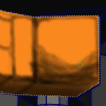
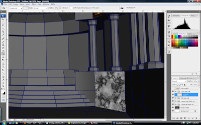
Next thing I do is to turn down the opacity of the color layer to about 75% so that I can see the polylines underneath. Then I very roughly sketch out the details of the surface, and indicate shadow areas on a new layer above. I did this with a 1 pixel black brush with about 50% opacity. This is the part where you're really going to need to use a stylus, as I can imagine using a mouse being nothing but pure hell at this point. This is also the point where you're going to have to make basic decisions about the design of the material (How are the bricks interlocked? Are they smooth, or roughly chisled?) and where your lightsources are. You definately need to go find yourself good reference materials to copy.
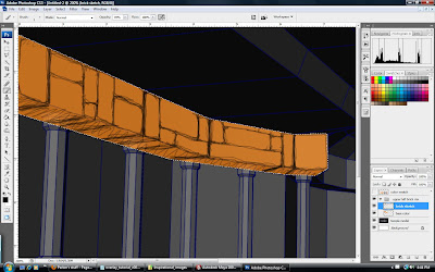
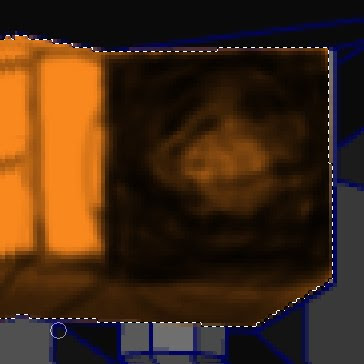
I decided here that my main lightsource was the dome opening in back, which means this area I'm working on should be in shadow, but I decided that I'm going to put candles here later so sides will have illumination at certain spots. So the only area in complete shadow will be underneath, and the spaces inbetween the bricks. Then using the burn tool (about 4-8 pixel brush size, range: highlights, exposure: 25%) I carefully burn in the details onto the color layer by tracing under the sketch. (You can turn opacity of the color layer back up to 100%, and the sketch layer down to 10% to better see how the burn is going.)
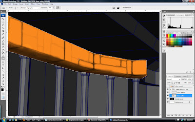
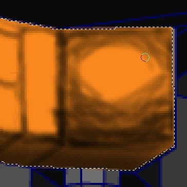
Now here comes the fun part, I decided that my bricks are going to be extremely rough and chisled, so here's a trick I learned on how to draw that effect. Its a bit hard to explain without seeing it done live, so I'll do my best to explain here.
Keep your burn tool set to the same settings as above, I've decided here that my lightsource is going to be a candle right next to it so its going to be lightest in the middle and darkest at the edges of this square brick.
Simply put- just burn the dark areas in, don't be too exact, try to be a bit random, that randomness will result in small patches that are dark near the center (where you went to far in), and light near the edges (places that you missed) which "sell" the bumpiness of the brick. Here's kind of a time lapse of what I'm talking about.
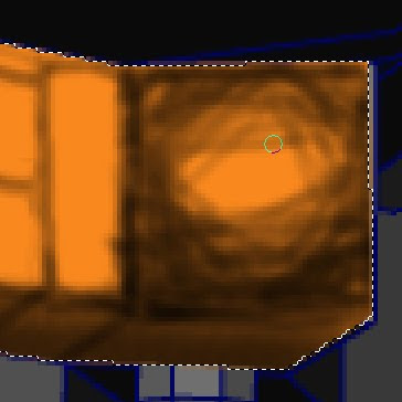
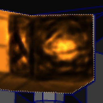
Makesure though that when you do each pass as I've done here you actually lift the stylus off the tablet (or re click the mouse) or it won't darken already fully burned areas.
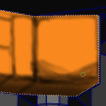
If you find that there are long dark lines in the brick go with it, make them even more dark as they will come off as ridges in the rock. Like the brick on the left.
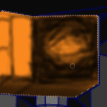
Now go in with the dodge tool (same range and exposure as before) and go into the little light spots in the darker areas and hit them a couple of times. Then scribble over the entire brick once or twice, and it will kind of pull out the highlights. You probably want to go back and forth a bit until you find something that works, maybe going in and dodging the midtones near the brightest areas to create a more smooth light decay.
The next thing I do is to create a new layer above the base color, that will be for my shadow colors. Basically cast shadows tend to be the complementary color of the light that is hitting the object. In this case the light is orange, so cast shadows should be blue. Form shadows tend to mute the color of the surface, and in this case my bricks are orange, so blue will mute them. (If my bricks were red I'd go in with green.) I just brush over the dark areas of the brick with a dark blue, set to a very low opacity and flow. Here's a picture but with the opacity of the layer set to 100% so that you can see what I did, but you'll want to lower the opacity to about 25% - 50%. It should be avery subtle thing, but makes things look more natural and less monochromatic.
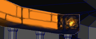
Now for another trick instead of painting every single surface in the scene, you can for instance paint just one row of bricks, then copy and paste sections of those bricks to other areas by using the "distort" transformation tool, perspective also works but distort gives you more control.
Thats essentially how I created my entire scene. I just put a base color down, sketched over it, burnt in the darks, dodged in the lights, put overlays for shadows or any other details, then copied and distorted sections all over the place so I wouldn't have to draw everything from scratch. (Which if you think about it will help you figure out how you're going to texture it, because theres going to be alot of repeating surfaces.) I hope this was clear enough and not too much of an incoherent ramble.
By the way here are some other surface materials I learned to create in photoshop.
Wood: this isn't so much a trick as its just part of photoshop, select a foreground color and a background color (for example a light brown and a dark brown), now select an area, and fill it with either your foreground or background color, go to Filter>Render>Fibers and play with the variance and strength settings, and now you've got wood! One thing you can try is to copy and paste a sliver of it, flip it over and lining the edges up to create that kind of wood grain mirror effect.
Marble: select white as your foreground color and black as your background color. Fill the selected area with white and go to Filter>Render>Clouds then go to Filter>Stylize>Find Edges. Now before you attempt the following create a hotkey for Filter>Render>Difference Clouds. (goto edit>keyboard shortcuts to do that) Now hit the difference clouds hotkey about 20 times or so until you get something that kind of resembles swirling lightning.
Now go to Image>Adjustments>levels and adjust the grey slider, and maybe the white slider, until you have something resembling sharp marble lines. Real marble has a number of sharp and soft layers within it so now create a new layer on top and redo the exact same process (but maybe leave the levels alone) except drop the new layer's opacity so that you can only see a hint of it. And then merge the two layers.
Its not a perfect effect but it works. You can try instead of black and white different colors, but the effect is kind of unnatural, instead try putting a sold color layer underneath and set the marble layer to multiply or overlay to colorize it.
Tile: Just create an image and go to Filter>Texture and play around with the different patterns.
I should note though that for tiles (and the marble and wood effect I think) you should create the image and apply the filter FIRST before you distort it to match the perspective, otherwise the tiling won't match the perspective.